List layout
Use the icon on the left of the rounded box at the top of the list to switch between List and Magazine (swipe left and right). The icon shows the layout you'll get when you tap it (in List, it shows the Magazine icon). The 🔍 on the right of the same box is Search. The same layout is used in every folder. It's the same setting as Settings > Appearance > Article list layout.
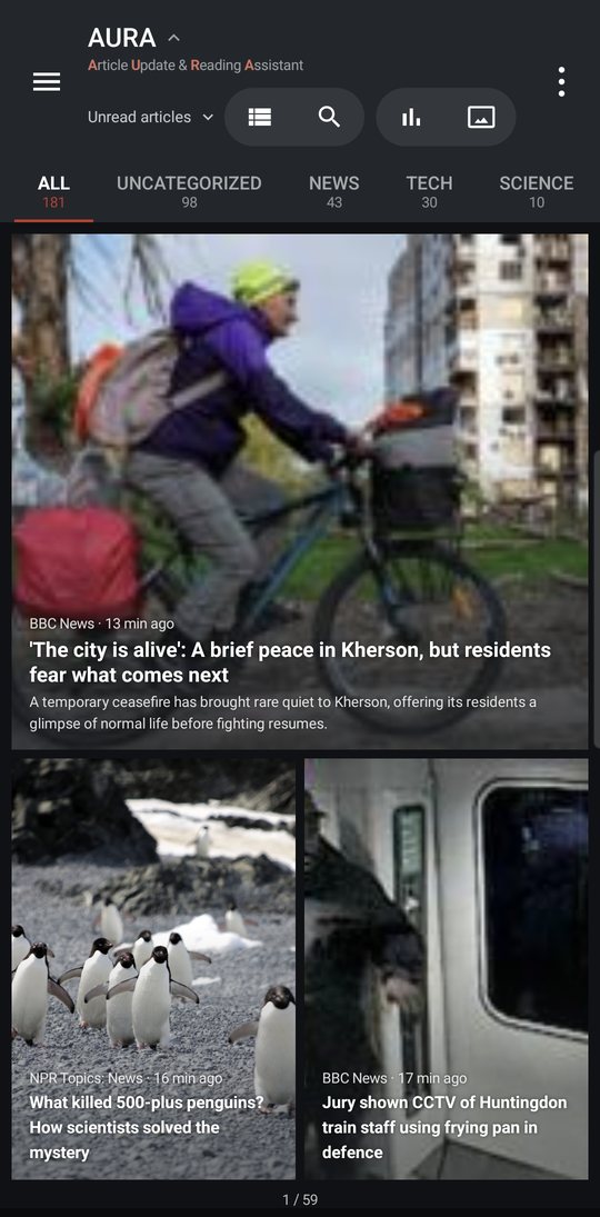
Choose how the list is arranged from three options in Settings > Appearance > List look.
| Mode | How it looks |
|---|---|
| 2 columns | Two columns. Now and then, an article with an image is shown large across the full width |
| Large cards | One column with large images |
| List | One column, compact and text-focused (the default) |
Images
In Settings > Appearance > List images, choose one of three options.
- Don't show — The list shows text only
- On Wi-Fi only — No list images while you're on mobile data
- Always show
To hide images for one feed, turn off Show article images in that feed's settings sheet (see Folders).
How articles open
Go to Settings > Read & listen.
- Open in browser — Tapping an article in the list opens the original page, skipping the article screen
- Use in-app browser — When on, AURA uses Custom Tabs (a browser that opens on top of the app). When off, links open in your device's browser app
Either way, your browser shows the page. AURA never displays the site itself.
Other settings
- Scrollbar (Settings > Appearance > Scrollbar) — Shows a scrollbar at the right edge of the list. Drag the handle to jump quickly. While you drag, it shows the date of the article at that position. You can choose the Color, Width, Opacity, and Shape
- Show embeds in articles (Settings > Read & listen) — Shows YouTube videos and X posts in the article in a frame (they load only when you tap them)
- Notify when parts are hidden (Settings > Read & listen) — Shows a “N parts hidden” banner above articles that have hidden parts